


This article is intended to assist you in overcoming designer’s block and providing actionable ideas to ignite your creativity. Also, is meant for the novice in the field of website design, either you are a business owner looking to hire an in-house marketer or a specialised agency or you are an entrepreneur looking to do itself, our guide is going to explain what, how and when a website layout is considered a good one.
No matter who you are from above scenarios, let’s get started with some web design suggestions you can use right away followed by how you should layout websites and the importance of web page layout and last, but not least see some website layouts examples.
Have a Step-by-Step Plan
As the saying goes, failing to plan is intending to fail. This also applies to web design. If you’re having trouble coming up with website design ideas, it could be because you haven’t addressed the essentials yet.
Only until the fundamentals are in place will you be able to add creative flourishes. To properly design a website, you must first determine its purpose and goals. A good goal is SMART, which stands for Specific, Measurable, Attainable, Relevant, and Timely.
Then, sketch out the buyer’s journey and arrange the website to bring users to the targeted goal. Developing a style guide with standardised fonts, colours, and design elements helps design consistency and uniformity.
It’s also critical to plan for search engine optimisation (SEO) by building a website map that shows how material is organised for both visitors and search engines. Google is an excellent example of how to use a style guide and plan for SEO.
Focus on the Structure
Similarly to establishing a strategy, focusing on your website‘s structure first allows you to step back from the process and obtain a bird’s eye view.
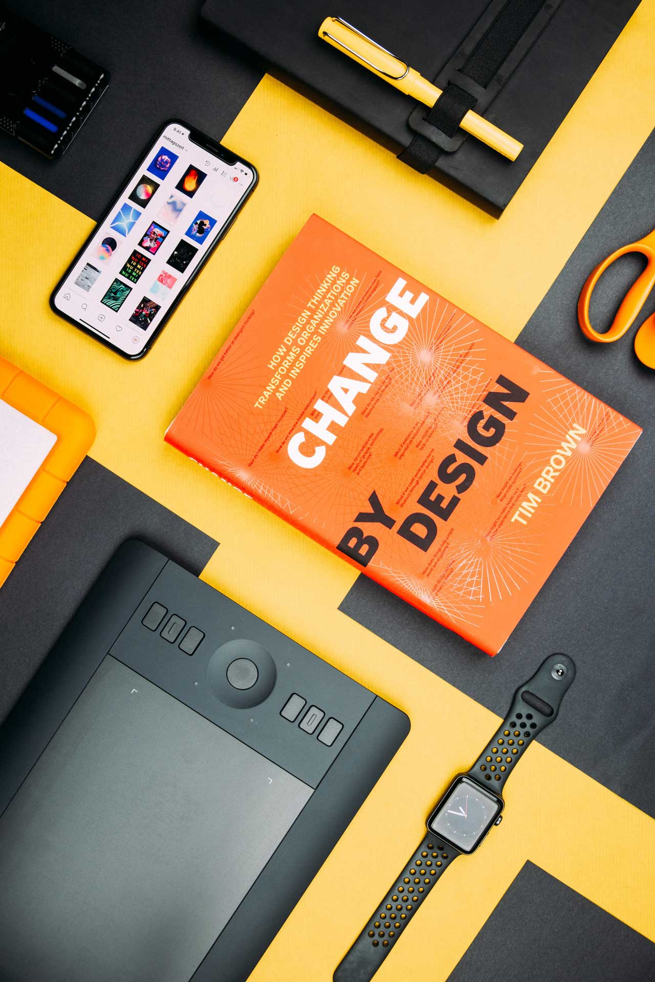
Working with a media other than your computer can be beneficial. For example, by sketching on paper with a single pen, you can temporarily disregard colours and other features. You can even make the whole process collaborative if you use flipcharts or a whiteboard.
A fun task is to draw the webpage on a post-it note. This will push you to limit your purchases to the necessities. A variation on this is to design in grayscale first and then add colour later.
Keep in Mind the Web Standards
Either your are a designers or not, we are born with the desire to become creative and inoculate our preferences in our product, items or service. In general, this is a positive thing.
However, when comes to web design, there are a lot of established standards and are there to help the day to day user navigate your site. Also, keep in mind that what you find intuitive and easy to follow, someone else can find it difficult for different reasons.
Some design clichés and website features are familiar to visitors. When you violate those guidelines too frequently, it may confuse and turn them off. Among the established standards are the following:
- Branding and design consistency across all pages
- The website logo is located in the upper section, predominately in left corner.
- Contact information can be found in the upper right or middle of the page.
- The main navigation bar runs across the top of the screen.
- The main headline/value proposition and call-to-action are prominently displayed on the homepage.
- The header or the footer contains a search function
- Social media icons, privacy policy and terms and conditions links are in the website footer.
Focus on Minimalism and CTA buttons
When you understand the purpose of your site and pages, you may eliminate everything that does not suit that purpose. This simplifies your design and makes it more appealing to the eye.
Again, there is research to support this. Google discovered that visual complexity is negatively connected with website appeal in the same study discussed above. In a nutshell, no one wants to be overwhelmed! Simplifying your design benefits other aspects, such as website speed and a “less friction” customer’s journey increasing your chances to convert visitors into clients.
Some good examples of what you can eliminate from your web page design and layout are overcomplicated menus – of course, you want your visitors to explore as much as possible of your site. However, having and overloaded menu can become confusing. Another example, are the sidebars which in later years are phasing out and overused phrases, cliches and hollow words.
Start with Mobile Format
Mobile devices have taken over the globe. Phones and tablets are increasingly used to access the internet more than desktop PCs. Google launched their new mobile-first index. What that means? The search engine prioritise every website based on its mobile presence. If it isn’t doing its job properly, you will suffer a drop in search rankings.
As a result, while developing a website, it is a good idea to begin with mobile. Mobile users will be your major clients from now on. As a result, you must ensure that they feel cared to, your site is mobile friendly and meets all the guidelines when comes to accessibility, interaction and easy of use.
At the same time, it’s good practice for coming up with website design ideas, as mobile size first. Again, starting with mobile forces you to concentrate on the essentials, page layout, CTAs and the purpose of its design. You can then further unfold and add elements as the screen size grows bigger.
The most common layout websites options
So, now that we have covered the some web design recommendations, let’s see what is a website layout, why is important and see some examples.
As mentioned before, a poor design can lead to confusion and disorientation, resulting in a negative user experience. Vital information may be overlooked, and calls to action may go unnoticed.
As a result, before you begin developing a website, make sure that the layout concept is clearly specified. A well-designed web page layout not only improves the user experience, but also draws attention to the content of your website and your desired focal area, as example a Call-To-Action.
A poorly designed layout, on the other hand, might make your material appear cluttered, difficult to read, and unpleasant. From experience, we’ve seen it so many times, where clients wanted to add as much information as possible to make sure their potential customer saw all the benefits, specifications and history of their products in one page, on every page.
Ultimately all sites have a grid system that sits beneath the website design. This system is made up of columns and rows that help to organise your information and guide the user’s eye throughout the page. Designers can use different ways inside these grids to produce distinctive designs.
a. Single Column Layout
Despite being the most straightforward layout available, it has increased in popularity dramatically since the rise of the mobile web. Because the website may use the same design on mobile devices, tablets, and desktop computers, development time is reduced.
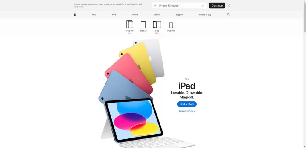
Furthermore, single-column layouts work well for producing an excellent reading experience because they focus the user on the information with no distractions on either side. A good example is the Apple website, in particular the iPad page.
Because of its simplicity, there are few challenges around a single-column layout. However, you do need to consider the flow of information carefully. When implemented correctly, single column layouts satisfy both the user experience and the user interface, making it not only convenient for users to visit your site (regardless of device), but also noticeably visually appealing.
When To Use Single Column Layout
- Textual stories in a personal blog or an article.
- Minimalist design.
- Mobile-friendly design.
b. Two Column Layout
A two column layout is one that divides a page into two vertical portions/columns, breaking the screen into two vertical pieces (the sections can be of equal width but can also be split unevenly). Two column layouts are recommended for pages with two primary pieces of material that are both important.
The benefit of a two-column layout is that it makes use of the page width, allowing for rich, detailed pictures alongside explanatory paragraphs that use the fewest words necessary to tell their message. The lines are short, the call to actions are clear and easily identified, and the visuals depict the linguistic content effectively.
When To Use Two Column Layout
- Showcasing visuals and text elements of mutual importance.
- A highly engaging, or even interactive experience.
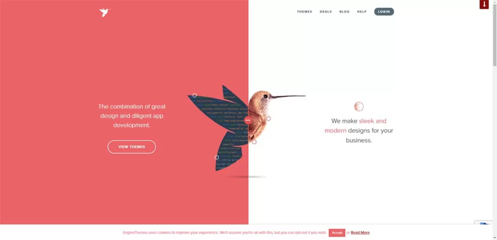
c. Split-screen Layout
A split-screen layout is an interface layout that divides the website’s main page or landing page into two or more vertical portions. Designers can use this design to offer several types of content or messages on the same page. As a result, users may quickly choose between various user flows in a very natural “left or right” type decision.
More screen space draws users’ attention to an attractive image or CTA button when employing a two-column split-screen, allowing you to funnel customers to the desired portion of the website.
A split-screen layout is ideal for designing a responsive website. Split screens can be displayed differently on different computer or mobile displays and can change more easily than a standard design. A split-screen design on a mobile device might stack up with numerous vertical pieces, whereas on a PC, the website adapts to the device.
When To Use Split-Screen Layout
- Two (or more) distinct options to promote
- Highlighting a vertical image.
- Layout directly corresponds exactly to the visual flow.
- Contrast between two or more content types or areas.
- It is perfect fit for minimal website design
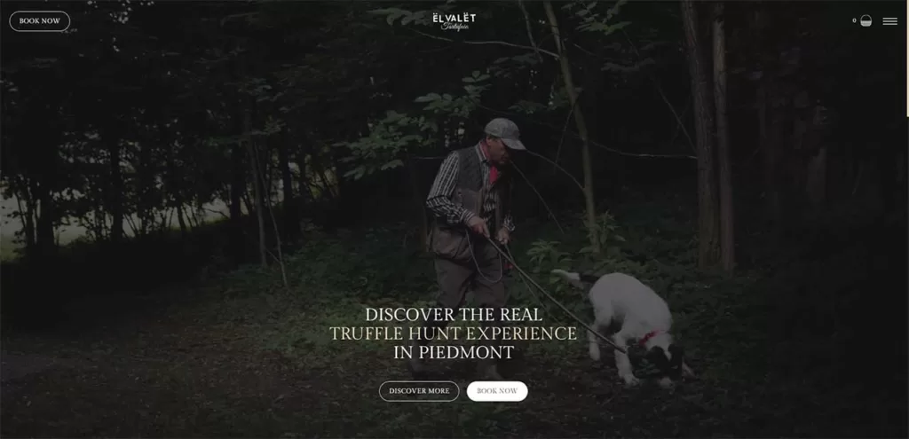
d. Full-screen Layout
Full-screen media layouts are advantageous in web design for a variety of reasons, such as: delivers an excellent experience, are excellent for responsive design, an eye-catching yet straightforward design option, simple to create and they pique visitors’ interest, causing them to scroll down and learn more.
This use of a full-screen media layout (either is with a video or high quality images) is a one-of-a-kind work of design inspiration. A good example is this website: El Valet. It not only provides the website visitor with a truly authentic focal point of what the business or product symbolises and delivers — it also accomplishes more. It provides a more realistic, interactive view of the subject. Because of the authenticity of full-screen media, this form of media layout aids in the establishment of user trust.
When To Use Full-screen Media Layout
- Conversion rates are a top priority.
- Quick user decision-making.
- Emphasizing the use-case of your product.
- Strong branding.
e. Grid Layout
Grid layouts, like seen on Grundini website is a powerful way to present multiple imagery and works of art in a single interface. The general grid’s colour block style alleviates the issue of managing varied colour contrasts across multiple pictures, which is always a balancing act in web design.
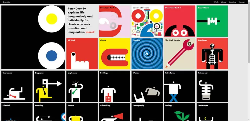
This design option, which begins as a modular grid and then dabbles with the hierarchical grid layout approximately halfway down the page, informs visitors about which projects may be more dominating within the design portfolio.
Another distinctive design technique, is the absence or presence of image gaps, sometimes known as gutters in web design language (or alleys). When built correctly, symmetrical grids (particularly grid-shaped image galleries) can add a distinct, eye-catching appearance to online content.
When To Use Grid Layout
- Organized-looking archive pages, media portfolios and media galleries.
- Your content should go as overlays
- Blog with a clean layout.
In conclusion, either you are a novice in web design or a business owner looking to understand how and what a web designer looks for, getting a robust and well designed website requires a step-by-step plan. Also is important to focus on structure, web standards, prioritise minimalism and mobile format, and last but not least, understand the importance of website layout.
By following these recommendations and considering the website layout examples provided, your desired website designer can create appealing and user-friendly websites that meet their purpose and goals.
Remember that a good website design is not only aesthetically pleasing but also enhances the user experience and increases the chances of converting visitors into clients.
And, as always, if you have any struggles or have questions please feel free to contact us. We are more than happy to assist you and to give our advice.